
Every day I see despairing posts and re-posts of articles and blogs claiming that the pandemic in America is a lost cause. One post that is currently getting massive attention asserts that the epidemic in the USA is now in a runaway state that can no longer be brought under control. Another simply assumes that this is true, and concludes that Covid-19 will eventually infect everyone in America, killing 1% (3.25 million people) and crippling or otherwise disabling many tens of millions of us in gruesome ways.
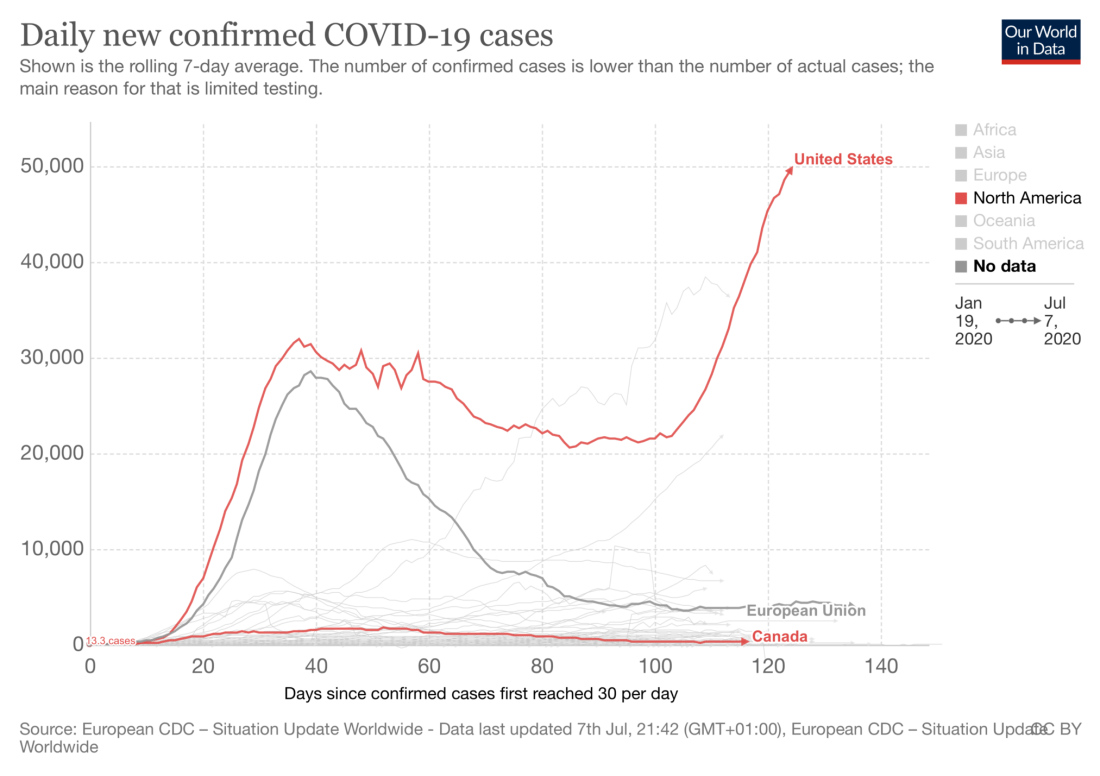
None of it is true. The ubiquity of graphs like the one below make this feeling understandable on an emotional level but the despair it engenders is completely inconsistent with the facts. The appropriate emotions in response to the graph below are (a) fury and (b) hope.
By way of making the case for hope, I’d like to lay on you one of the most remarkable and under-publicized bits of research I’ve come across but first we need to look at some basics.
Why Fury?
No mystery here. Our government’s epochal mishandling of Covid-19 has been so bad that it has shaken international confidence in the United States as a world leader. Just a few years ago the US led the world in combating epidemics; we were ready on short notice to jump on the pandemic everyone knew would come some day. Yet when it finally came, our response would have embarrassed a third world dictatorship.
Calling it a “failure of leadership” is too kind. The president has actively worked to thwart effective handling of the pandemic, undercut public health authorities, subverted state efforts to handle it, calls Covid-19 a hoax in public speeches, and preaches openly that masks are for liberal crybabies. Shamefully, the Republicans in the legislature have backed the president to the hilt in order to curry favor with the right-wing base in the upcoming elections. It’s a shameful time for the Republican party.
In fairness, there’s more wrong than the president. The agencies haven’t stepped up. The CDC are supposed to be the pros from Dover. The big dogs. The Delta-6 of medicine. FEMA is the muscle. Yet they responded like the weariest sort of bureaucracies. Does any American even know the name of whatever career bureaucrat is the head of the CDC? I don’t. I must have heard his name—I know Fauci’s name. Uninspired doesn’t say it.
The perversity of our handling of Covid-19 is changing the course world history; scholars will study and write about it for decades.
But Why Hope?
The graph is appalling if you concentrate on the red line to the right of day 100, where it takes off almost straight up, but hold on—look back at day 40. That’s just a couple of weeks after the whole “flatten the curve” thing started but the exponential growth of new cases simply stopped like Roadrunner screeching to a halt.
This has has absolutely nothing to do with medicine—it’s 100% purely behavioral. It wasn’t like Walter Reed’s troops out hunting down standing water to eradicate malaria-bearing mosquitos; it was just words. Authorities told non-essential businesses to close and asked people to stay home, wear masks, and wash their hands. That’s it. It wasn’t very strictly enforced or carefully followed even in the most demanding regions such as NYC and Northern New Jersey yet America’s curve flattened immediately. The R value for Covid-19 went to almost exactly 1.0 almost overnight.
The lesson to take from this is that it’s not hopeless at all. Far from it—the disease is exquisitely and immediately responsive to relatively minor changes in group behavior.
Before we start patting ourselves on the back, that striking success is actually America’s shame. Look at the pale gray line of the European Union. The EU’s line didn’t level off—it plummeted. Today Covid-19 is basically a nuisance in Europe, not a catastrophe. Yet, in fact, even Europe’s far superior handling of the epidemic was lame compared to some of the Asian countries and New Zealand where Covid-19 was simply extirpated. If a handful of cases of the liberal hoax pop up in Korea it’s international news and the Koreans are on it like white on rice, acting it like it could be a plague.
Actually, That Graph Hardly Says It
All by itself, the graph above should convince anyone Covid-19 is highly controllable but as clear as the message is, that particular graph makes the weakest possible case because it munges together data from the entire country. Here’s what New York State’s graph looks like. New Jersey’s is similar.
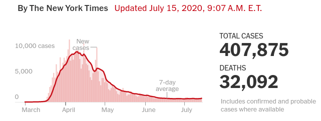
It looks pretty much like Europe’s doesn’t it? Here in NYC it’s down to a tiny fraction of where it was at the peak. New York doesn’t have some kind of huge natural advantage. With extraordinary population density and an economy that depends on moving several million people around every day on packed trains and busses, NYC is the closest thing the USA has to a Covid-19 playground, yet the disease responds to commands like a well trained dog.
The Most Amazing Statistics You Never Heard Of
Yet even that isn’t the strongest case. Consider the graph below. Do you see those extremely regular ups and downs that overlay the long term arc? They have a frequency of 7 days, so I never gave them that much thought because I just assumed that the regularity was an artifact of testing practices. Shame on me.

The phenomenon was studied and reported on recently and it’s real. Every Monday morning the infection rate shoots up, stays at a fairly constant rate until Friday night, then plummets. It’s because people stay home more on the weekends and don’t interact with others as much. This isn’t some guy on the Internet guessing—it’s been studied carefully by real scientists and the results are clear within tight statistical bounds.
If you already understand R and exponential growth, please skip the next section. Otherwise, here’s a quick refresher you might need to make sense of it.
A Quick Aside On R and Exponential Growth
Lots of people are confused about the use of the terms “exponential”, “R” and “R-naught”, fleeing in panic from the scary math. Don’t let it buffalo you. If your know how interest rates work you already understand the hard part.
If you put $1 in the bank at 10% annual interest, then after one year you have $1.10. Ok, but after 30 years you don’t have a dollar plus 30 dimes, which would be $4. You have $17.45! That’s exponential growth of money. The extra $13.45 is because the dollar turned into 1.10 after one year and the following year the 10% interest applied to the whole $1.10. It takes off slowly but by year 8 you have $2.14 earning 10% interest and year 14, you’re earning interest on $4.18. It just keeps compounding.
Disease grows the same way and you can think of R as the interest rate. If R=2 it means that each person who gets Covid-19 gives it to an average of two other people (200% interest in money terms, except that it’s not per year, it’s per generation of transmitting the infection.) So one person gives it to two, they give it to four, they give it to 8, and so on. Computing the actual number of people who will have Covid-19 as a function of R and elapsed time is more complicated than compound interest because of an element of randomness and other details but it’s the same basic idea.
You’ll hear both R and R-naught, AKA R0. Think of R-naught, the basic reproduction number, as the raw contagiousness of the disease. It’s an abstraction that doesn’t reflect the particular real-world circumstances such as the number of who already had it and are therefore immune.
Plain R, the effective reproduction number, is the number we mostly care about. It’s not an unchanging abstraction. It tells you the average number of people an infected person will pass the disease to at a given moment in history. For one thing, as time goes by, a larger and larger percentage of the population becomes immune or partly immune because they’ve had it and gotten over it; critically, R also goes up and down depending upon how people behave.
Either way, R is the driver of exponential growth.
If R equals 1.0, an epidemic neither grows nor shrinks. It’s like an interest rate of zero.
If R is greater than 1.0 you are earning interest. Over time, the number of active cases grows inexorably larger. The bigger the R, the faster the number of active cases grows.
One thing R has that interest rates don’t have is that R can be less that 1.0 which is equivalent to a negative interest. Interest is practically never negative in the real world; it’s always always zero or greater because otherwise your money in the bank would shrink asymptotically toward zero. For R,the equivalent to interest being negative would be an R value greater than or equal to zero, but less than one. It means the average person with the disease passes it on less than one person. When this happens, you get what is called exponential decay and the disease dies out when the last person fails to pass it on.
A Quick Aside on Masks
The official position of the USA health authorities on masks wasn’t as clear as it might have been early on. One problem is that everything related to health gets radically dumbed-down for public consumption and is even somewhat dumbed-down for doctors, who usually are not as well-trained in statistics as public health people are.
In the case of Covid-19, the authorities were also initially afraid that if they were forthcoming about the facts relating to masks it would lead to a run on the supply by the public which would in turn result in more acute shortages for critical health care workers. Indeed, this is exactly what happened.
Less well known is that the scientific literatures several months ago was neither complete nor consistent on the subject of the efficacy of masks for ILI’s. Legitimate papers gave very different judgments with some even discounting their utility entirely.
We know that the amount of protection masks supply varies widely with:
- The specific influenza-like illness (ILI)
- Whether you’re talking about medical settings, a non-medical settings, use at home, etc.
- The type of mask–surgical, N-95, simple cloth coverings, etc.
- The nationality you’re talking about. (Asian countries do strikingly better than Western countries for reasons that are not 100% clear.)
- What kind of protection you mean: protecting the wearer from others is an entirely different ballgame than protecting people from the wearer.
The situation is clearer today in part because of what are called “meta studies.” These are studies of large numbers of other studies. They use advanced statistical techniques to merge data and conclusions from different kinds of studies and can reach conclusions that are beyond any one contributing study. Statistics is a difficult field and meta-studies are the rocket-science of statistics. Unless you’re a pro, you have to take their word for it.
Readers who do not have some statistics background may find this report on a meta-study of mask effectiveness difficult to understand. It is a complex analysis so any short summary is necessarily incomplete but I would summarize the conclusions as:
- The benefits for health-care workers (HCWs) are huge. At least an overall 80% reduction in infection rate for hospital personnel in high-risk environments. That’s protection of the worker.
- Masks worn by HCWs and visitors also have a very large effect protecting patients, particularly immune compromised people, the elderly, etc., from the HCW’s.
- Masks worn by the general public also appear to have a large effect. The risk from influenza, SARS, and COVID-19 infection are reduced by 45%, 74%, and 96% respectively by wearing masks.
Wearing masks on trains and planes is a typical situation of concern (according to the article.) The authors mention a case study in which none of the flight attendants nor the 25 people closest to a masked person with Covid-19 on an international flight tested positive later.
Bottom line: the data is in and masks are the unquestioned bomb for ILI’s, but particularly for Covid-19. If everyone wore masks routinely the great majority of Covid-19 transmissions would not occur.
Back to What Is So Amazing
The one thing to take away from the explanation above is that you don’t have to drive R down to zero to extirpate a contagious disease. Not even close. All you need to do is get R below 1.0 The farther down the better, but as long as you have R<0, the disease inexorably withers away.
The authors worked out the R value of Covid-19 in the US day by day. If you look at the graph at the top of the page before the dates where rates starts to skyrocket a couple of weeks ago because of ill-considered reopenings, you see a long, shallow, steady, trend down. That’s because R overall was 0.996. In this period, the average person with Covid-19 was passing it to slightly less than one other person before the carrier either died or recovered. Therefore the disease was ever so slowly dwindling away. This was well understood before the study.
The important thing the study found was that over the weekend, because on average people are less exposed to each other, R drops to between 0.850 and 0.856. That’s a measly 1/7th of a person difference in the mean number of people someone with Covid-19 would pass it on to, yet the curve tilts strikingly down all weekend until Monday AM when it’s at its lowest.
Unhappily, on Monday morning, R jumps up to between 1.165 to 1.177. That is an increase of a little less than 1/6 of a person above the mean R, but suddenly the curve tilts up sharply through Friday.
Not everyone works, especially now. And those who do work don’t all work only Monday through Friday. Moreover, a portion of those who do work, work outdoors away from others, e.g. mail carriers, truck drivers, etc. Nevertheless, that one change shifts R by about 0.315, a little more than 1/3 of a person, but that’s enough to change the rate of new cases from rapid decrease to rapid increase and back every week.
Putting The Studies Together
The meta-study on masks puts the reduction in transmission from masks alone at levels that dwarfs the weekly fluctuation resulting from people going to work.
The average R cited in the study of weekly cycles is 0.996 infections passed on per infected person. The 56% reduction in transmission for all ILI’s is much lower than for Covid-19, but even using the low number for a crude ballpark estimate knocks the disease out of the park, so to speak. Remember, for you personally what matters most is how much your mask protects you, but how much it protects others from you is even more important when you look at it globally.
If it reduced the R of 0.996 by 0.56, R would be 0.44. If the typical case of Covid lasts three weeks, mid-October, which is 12 weeks or 4 Covid-19’s infections away from today, we would see only a dribble of cases remaining.
Why should this be hard to believe? Masks and distancing are the core of the strategy that has crushed it in many other countries within similar time frames and it’s the key to keeping it suppressed today, now that the lockdowns are over. (Testing and tracking are important but it only works if you’re already suppressing most of the transmission.) It’s true that many used mass quarantine to get a leg up quickly, but mass lock-downs were relatively brief and in many places very far from complete. The extreme effectiveness of universal masking wasn’t as well understood then. The meta-study doesn’t explicitly draw the inference, they clearly say that wearing masks in the house as well as outside of the house would have all but eliminated the transmissions that resulted from one member of a large family passing it to many others that they were locked in with.
So What Does One Take Away From All This?
Lesson #1: Covid-19 transmission is so sensitive to our behavior that just the modest change in the transmission rate that results from weekly fluctuations in the number of people going to work, if it were maintained, would be big enough to turn a disastrous runaway epidemic into the situation enjoyed by Europe or even the Asian countries today.
Lesson #2 It tells us that far from being hopeless solving the problem doesn’t even have to be hard. It would demand some effort, but the pain would be negligible compared to the pain we’ll suffer from millions more cases and a continued economic collapse.
Lesson #3 We’re only talking about one variable—everyone wearing masks. That by itself is sufficient but there are plenty of other things we could do to lower the rate even farther and we’re not counting the ancillary benefits that come with reducing new cases. Just to name a few, the fewer new cases we have, the more we can meaningfully track and trace and the larger the percentage of those who are sick that can be isolated in hospitals away from their crowded households. Also, test accessibility and turn-around time also improve, making it easier to nip hotspots in the bud before they get out of hand.
Bottom line: It’s not hopeless–it’s not necessarily even hard. It’s just everyone acting like they are full grown responsible adults and recognizing that every-man-for-himself has no place in an epidemic. That attitude is the one thing that will sink us.
